

Brand Strategy in 2026: Why Most Indian Brands Look the Same (And How to Stand Out)
Brand strategy in 2026 has a new problem: AI mood boards are quietly making Indian brands converge on the same beige, minimal look. Here's why brand positioning is collapsing into sameness — and how to build a brand identity that actually stands out.
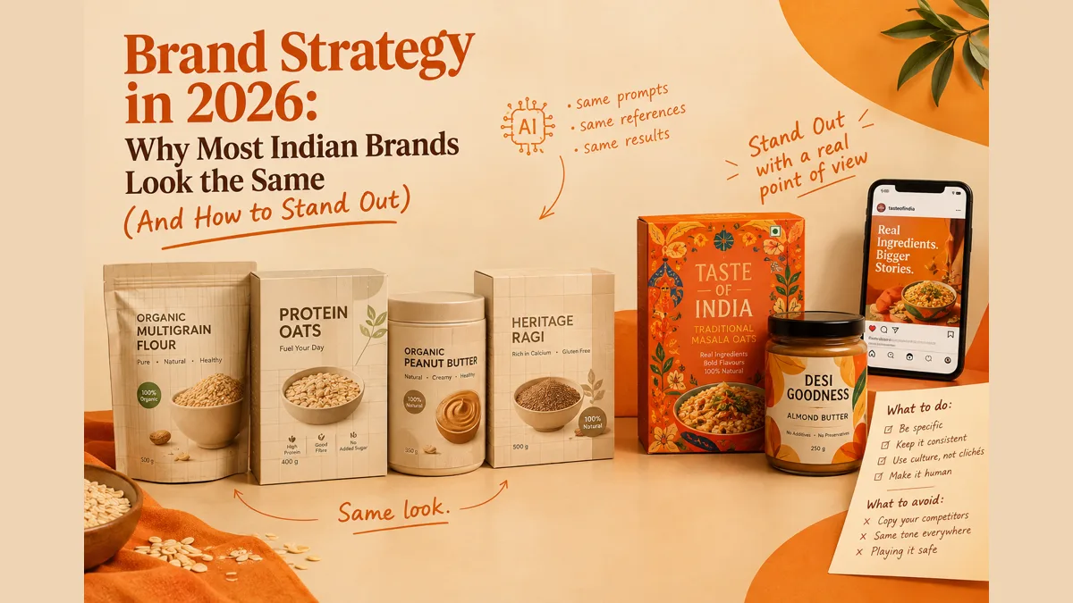
Brand strategy in 2026 has a problem nobody briefed for: the tools brands use to find their look are converging everyone toward the same answer. AI-generated mood boards, trained on what's already common, now sit at the start of most Indian D2C branding projects — which is why so many new brands independently arrive at the same beige, minimal, badge-covered identity. Standing out now requires deliberately pushing against the average, not toward it.
A founder once showed me his new D2C packaging with real pride — beige tones, a minimal grid, a bold product name, a health badge, a clean bowl shot of the product. It looked genuinely polished. It also looked, almost exactly, like four other brands I'd seen that same month. (If you run an online store, here's how this plays out in e-commerce marketing in India in 2026.) When I mentioned it, he said something that stuck with me: "That's what came up when I searched for inspiration."
That sentence is the entire brand sameness problem in 2026, in one line.
The insight nobody's saying out loud yet
Here's what's actually happening, and it's more specific than "brands are just copying each other" — a problem that's existed forever. Brand and packaging designers are now openly flagging a new pattern: founders are bringing in AI-generated mood boards as creative references, and those references are converging on the same visual formula — clean beige packaging, minimal grids, a loud product name, a health badge, a stock "bowl shot." Because AI tools are trained on what's already common and already proven, they don't generate genuinely new directions — they average toward the most statistically typical one. When that average becomes the starting brief for real product launches, the result is dozens of brands independently arriving at the same look, without ever seeing each other's work.
This isn't hypothetical. It's visible right now in Indian D2C: organic and heritage food brands have been drifting into nearly identical territory — one leaning into "soil-to-soul" organic narratives, another into heritage-and-nostalgia cues, others into clinical, protein-and-GI-focused functional messaging. Each positioning decision makes sense completely on its own. Looked at together across the category, they blur into one predictable system.
Why this matters more in 2026 specifically
A few years ago, brand sameness was mostly a visual design problem — everyone using the same flat sans-serif type and muted pastel palette. In 2026, it's become a strategic one, because the tools brands use to generate their positioning are the same tools converging everyone toward the same answer. That's a fundamentally harder problem to notice, because it doesn't feel like copying — it feels like every brand independently discovering the "best practice."
At the same time, consumer touchpoints have multiplied. A shopper now moves between a brand's Instagram grid, its website, its WhatsApp messages, and its physical shelf presence before deciding to buy — which means sameness isn't just a packaging problem anymore, it's a consistency-across-everything problem, and inconsistency is just as damaging as sameness when a brand's Instagram voice doesn't match its packaging tone. This is exactly the kind of system thinking behind a solid content marketing strategy in 2026 — every channel reinforcing the same idea, not improvising per platform.
The counter-movement: what's actually standing out
There's a real rebellion forming against this, and it's worth understanding both directions of it:
"Imperfect by design." After years of polished, gradient-heavy, AI-smooth visuals, some of the strongest identity work in 2026 is deliberately embracing texture, hand-touched type, and layouts that feel like a real human made a choice — not an algorithm finishing a template. The point isn't sloppiness; it's visible intention.
Indian Maximalism, not Western minimalism. A growing wave of homegrown Indian labels is rejecting the flat, muted, Euro-corporate minimalism that dominated D2C for a decade, leaning instead into bold cultural motifs, distinctive regional typography, and cinematic, narrative-driven imagery. Rather than a clean, safe, internationally generic look, these brands are betting that specificity — clearly, unmistakably Indian, not "global template with a bindi added" — builds stronger recognition than playing it safe ever could.
Both movements are really the same underlying bet: sameness might feel safe, but it's invisible, and invisible doesn't sell.
What to do vs. what to avoid
Do:
- Use AI tools for speed and drafts, but treat every AI-generated mood board as a starting point to deliberately push against, not a brief to execute — e.g., if your AI reference comes back with beige-and-minimal, treat that as the signal to explore a genuinely different palette and structure, not confirmation you're "on trend"
- Build one honest, specific point of difference and repeat it everywhere — a brand like Nua built recognition through genuinely direct, unfiltered category conversation, not just clean packaging
- Treat every touchpoint as one system — the same visual language and tone across Instagram, WhatsApp, packaging, and your website, not a different "voice" per platform
- Lean into specific cultural or regional detail rather than smoothing it out — bilingual packaging that gives Hindi (or another regional language) the same typographic care as English, not an afterthought translation
Avoid:
- Briefing a designer with "make it look like [competitor]" or an AI moodboard pulled straight from a generic prompt — this is precisely how five unrelated brands end up with the same beige pack and bowl shot
- Treating platforms identically — an over-designed, heavily branded LinkedIn carousel usually underperforms a plain slide with one bold, clearly stated idea; Instagram and LinkedIn have genuinely different visual cultures
- Chasing "premium minimalism" by default — over-simplified identities that strip away every distinctive element often become harder to recognize, not easier, once every competitor has done the same thing
- Assuming a logo redesign alone fixes sameness — the deeper problem is usually the underlying positioning and message, not the typeface
Real examples: brands that broke the pattern
Nua — customization as the entire positioning, not a feature. Instead of competing in India's crowded feminine hygiene category with cleaner packaging or a lower price, Nua built its entire brand around a single distinctive idea: periods aren't one-size-fits-all, so pads shouldn't be either. Its "Why Stick to One Size" campaign, fronted by Deepika Padukone, wasn't a generic brand-ambassador play — it directly dramatized the product's actual point of difference (customizable heavy/medium/light packs). The brand also built its product roadmap from a community of over 400,000 women rather than a design team's assumptions, which is why its expansion into cramp-relief patches and intimate care felt like a natural extension rather than a bolt-on. The lesson: Nua didn't out-design its category, it out-positioned it — one clear idea, repeated everywhere, backed by a real product difference.
Nuvie Protein — winning through restraint in a maximalist category. India's protein and sports nutrition category is dominated by loud, rainbow-coded packaging and hyper-masculine visual cues — genuinely the opposite sameness problem from D2C food's beige minimalism, but sameness all the same. Nuvie's rebrand deliberately went the other way: a single-colour brand world instead of competing on more colors, betting that instant shelf recognizability would outperform trying to shout louder than every other protein brand on the same shelf. The repositioning also shifted the brand's category from "fitness supplement" to "lifestyle nutrition," widening who it could credibly speak to. The lesson: sometimes standing out means being the one brand that refuses to play the category's visual game at all.
The cautionary case: heritage and functional food brands drifting together. Not every example is a success story, and this one's worth including precisely because it shows how sameness creeps in even with good intentions. Several Indian organic and heritage food brands — each with a genuinely different founding story — have gradually converged on nearly identical territory: soil-to-soul organic narratives, heritage-and-nostalgia framing, or clinical protein/GI-focused claims. None of these brands set out to look alike. Each positioning shift made sense in isolation, chasing whatever consumer language was working that quarter. Together, they've quietly become interchangeable. The lesson: sameness isn't usually one bad decision, it's a series of individually reasonable ones made without checking the wider category picture.
The real takeaway: what brands should actually do
Brand sameness in 2026 isn't happening because brands stopped trying to be different — it's happening because the tools most are using to find "what works" all point toward the same answer, and because individually reasonable decisions, made without checking the wider category, quietly add up to the same look.
If you're building or rebuilding a brand right now, here's the honest sequence I'd follow:
- Find the one real difference your product or story actually has — not a designed-in difference, an actual one. Nua's was customization. Nuvie's was refusing to compete on color. If you can't name yours in one sentence, that's the first problem to solve, before any visual work starts.
- Push every AI-generated or "inspired by" reference away from the average, not toward it. If your mood board looks like everyone else's mood board, that's information, not validation.
- Build it as one system, everywhere — packaging, Instagram, WhatsApp, website, and in-store, all saying the same thing in the same voice. Consistency compounds; scattered "creativity" per platform doesn't.
- Zoom out periodically and look sideways, not just forward. The heritage food brands didn't drift together because any single quarterly decision was wrong — they drifted because nobody stepped back to compare their direction against the rest of the category until it was already too late.
Specific beats safe. Consistent beats scattered. And the brands winning recognition in 2026 are the ones treating their one real point of difference as non-negotiable, not as one option among several equally "on-trend" choices. If you're working out where brand thinking fits in the bigger picture, start with what digital marketing actually means in 2026 — and if you're a founder doing this with a small team, digital marketing for small business in 2026 covers the budget side.
Building a brand that looks like everyone else's? Let's find your one real difference and build a system around it.FAQs
Why do so many Indian brands look the same in 2026?+
A major driver is AI-generated mood boards being used as creative references. Because AI tools are trained on what's already common, they tend to converge on the same visual formula — clean beige packaging, minimal grids, health badges — which multiple brands independently adopt without realizing how similar the result looks.
How can a brand stand out without a huge budget?+
Consistency and specificity matter more than budget. A clearly defined visual and tonal system used identically across Instagram, WhatsApp, packaging, and website builds recognition faster than expensive one-off campaigns that don't reinforce each other.
Is minimalism still a good brand strategy in 2026?+
Minimalism itself isn't the problem, but over-simplified identities that strip away every distinctive element risk losing recognition when every competitor adopts the same restrained look. The strongest 2026 identities are deliberately minimal, not accidentally similar.
What is 'Indian Maximalism' in branding?+
A growing counter-trend where homegrown Indian brands reject flat, muted, Western-style minimalism in favor of bold cultural motifs, distinctive regional typography, and cinematic storytelling, betting that specificity builds stronger recognition than a safe, internationally generic look.
Can you give an example of an Indian brand that successfully stood out?+
Nua, a femtech brand, built its entire positioning around a single distinctive idea — customizable sanitary pads for different flow levels — rather than competing on cleaner packaging or price, repeating that one idea across its product line, campaigns, and community-driven roadmap.
Keep reading
Written by Likita
Digital marketing, creative strategy, content & AI — Asia, UAE & Europe.